This app prototype was in partnership with Flave, a new dining incentive program created in the DMV area, planning to release its beta within a few months. Next, my group members and I decided to work on the restaurant accounts’ onboarding process. The onboarding process included account creation, marketing opportunities on the platform, and a preview feed to review ads on the users’ side. This project was completed during my time enrolled in the UX Design Certificate program. This project focuses on UX/UI elements like information design, icon elements, typography, color, and flow.
My Role
Designer - Restaurant's Flave Feed Ad Preview
Problem/Challenge
Design and develop an interactive prototype of the restaurant's onboarding perspective.
Solution
A new platform area where restaurant account holders can create and preview ads on Flave to promote new and existing dine-in specials.
Teammates
Alisa Hall, Sean Miller, Monica Stone
Timeframe
12 weeks
Tools Used
Axure RP9
Flave's Model
All local dining establishments that weren't classified as a corporate restaurant chain was automatically enrolled into Flave's system. However, to use Flave's features and get the most out of the application, restaurants/users would have to register/subscribe to one of the tiers.
Restaurants could use Flave to promote new dishes and discounts by adding their items to their menus to redeem Flave Cash. The items would show on a map for Flave users to find and redeem within the area. Flave users would then have to visit the participating restaurant, take a photo, earn points, or receive a discount.
The Challenge
This project’s challenge was designing part of the app that didn’t exist, talking to restaurant workers to find out the best feature, and keeping the design consistent between the team members. Our main goal was to create something that restaurant owners and staff could easily promote new dishes and deals to customers.
Paper Prototype
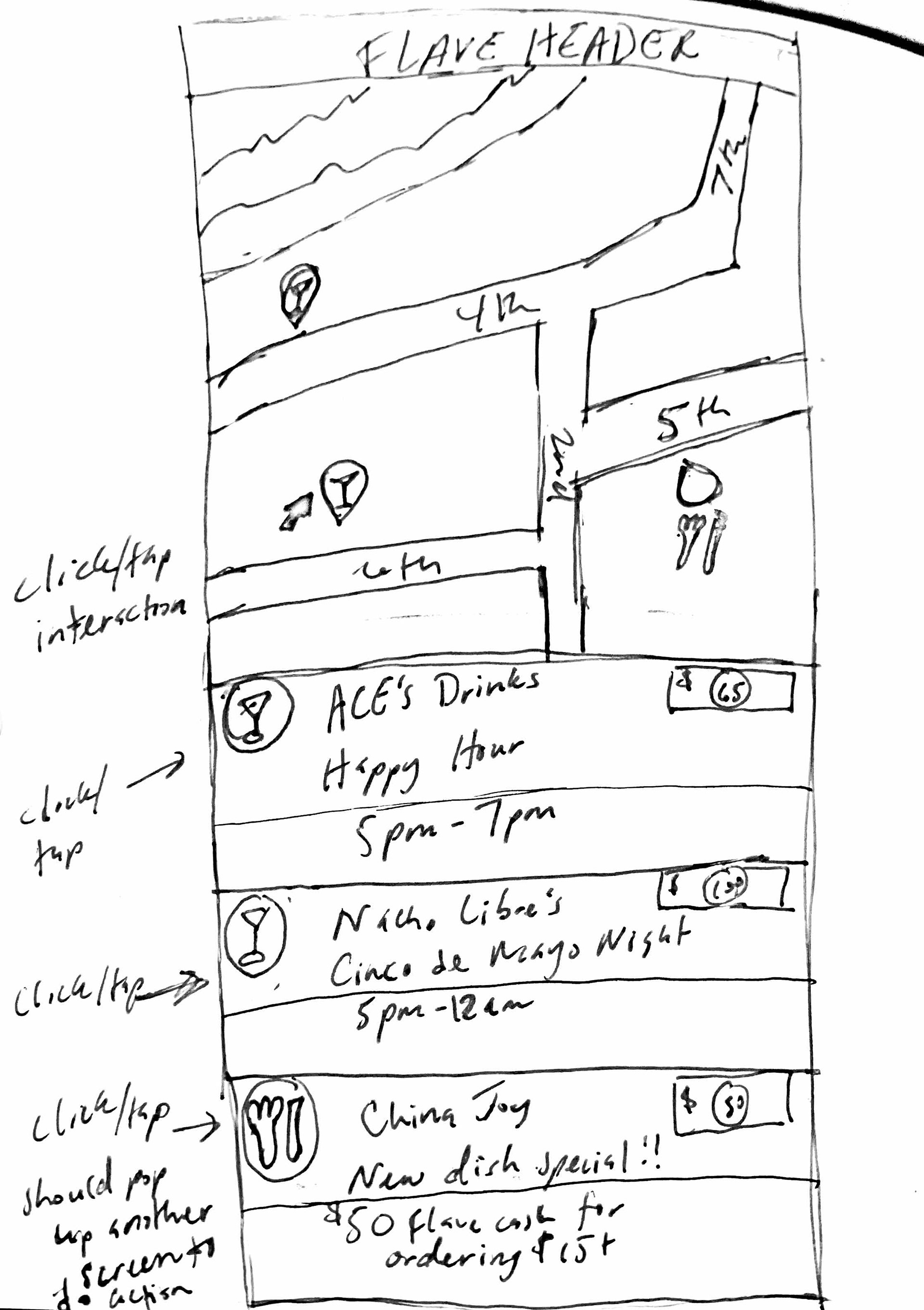
Once the team decided on what screens we would create, we thought of a low-fidelity prototype flow. Alisa created and recorded the paper version of the prototype.
Team Assumptions
Any ads developed within the Flave dashboard will automatically have the Flave logo on them, with a link to download the app to promote adoption.
Also, when the restaurant chooses a template type such as "Event" or "New Item," the related icon will appear on the user interface map showing what kind of promotion it is.
The restaurant would receive the "compiled" file to deploy as they wish, such as across social media platforms or in hopes of reaching Foodie influencers, event organizers, or others in the community.
When designed using a Flave template, the design tool would give the user the option to automatically save it as their "profile" within the app.
We are imagining that the user could define what type of ad they're creating, and the design tool would scale to the required size.
Lessons to Learn
We learned from our initial presentation that having 17 features was way too much to focus on originally.
We learned that it's really hard to design a calendar widget—lots of input needs to be included, with considerations about how to move forward, assign dates, etc. We assumed that meant programming one is hard as well.
We think, but don't know, that designing on a mobile device will be the restaurants' first choice, but it's pretty tight on a small screen. We plan to be careful with that during the design.
We have narrowed our options to Axure, Adobe XD or Protopie for the next phase.
User Flow
Initial Design
However, after creating the paper prototype, we realized that we couldn’t design all of the features that we wanted to show to the client within the given time frame. We focused on creating the restaurant’s profile, ad creator (similar to the Canva site and app), a scheduling module, and the preview stage of the ad from the user’s perspective. We decided to move forward and use Axure as design software to develop the prototype.
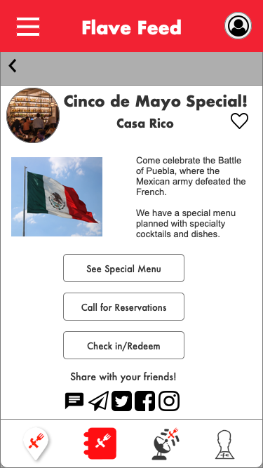
I decided to create the Flave Feed Preview for the restaurant staff to view promotional ads within the app.


Design Issues & Fixes
After creating the initial prototype in Axure, our peers critiqued it and provided feedback. We realized that our design elements weren’t the same regarding the restaurant’s perspective and the user’s perspective. We went back and made changes to the design to match both views and
be consistent.
be consistent.
I went back to the drawing board and made changes that made sense with the rest of my teammates' designs and flow. I included additional features, i.e., a notification and filter segment that would show the latest promotion. The final design was consistent with design elements, i.e., typography, color, and iconography.
Reflection
Looking at similar apps like iCal/Google Calendar, Canva and Amazon helped the team design a prototype that would give the client a blueprint to create their restaurant onboarding.
During the project, my team realized that the (Axure) cloud slightly hindered us when saving versions of the project and required some of us to recreate design elements. If chosen to do this project over, we might've used a different tool.
