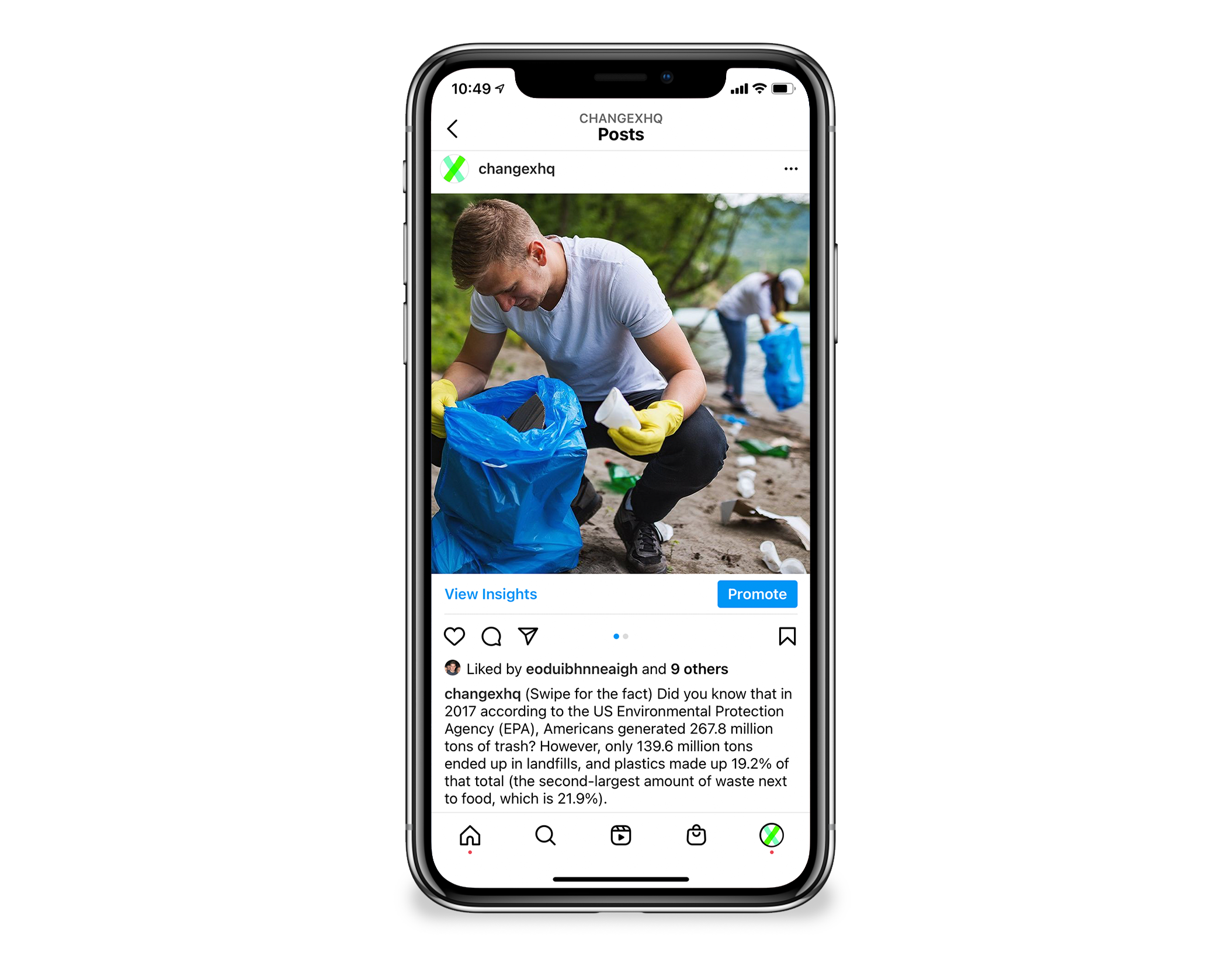
During my final months at ChangeX, the team discussed having a possible rebranding and website redesign. While I couldn’t participate in the rebranding and redesigning process, I designed a mockup of what could work for ChangeX and its community moving forward.
TOOLS USED
Figma
Rethinking Typography & Color
I started to look at their typography and color palette choices, and since I’ve used their design assets for a year, I wanted to simplify their design choices.
ChangeX uses two typefaces for their website, Circular Standard for paragraph sections and Grandstander Clean for headings and subheadings. I went with a simple sans serif font called Outfit, which is geometrically beautiful. Seeing the circular strokes of the letters reminded me of ChangeX’s goals to have one billion ideas shared with people around the world and that the choices we make to help one another come back to us full circle.
The primary colors are green and a grayish teal with yellow, orange, pink, blue, grayish off white, and dark gray accents. Keeping the green and teal in mind, I chose a lighter and vibrant green and white as the primary brand colors and a slightly greenish blue, light gray, and black for accents.
Using a lighter green helps represent the many sustainability-focused projects, and the monetary value starters receive when they choose to start a project on the ChangeX platform. The blue helps define ChangeX and the partnerships created with social innovators and corporations trustworthy. Since ChangeX is still considered a newer organization, building these relationships is key to solidifying funding for new and existing projects.
Page Layout & New Navigation
My next step was to look at the layout of the current homepage as well as their navigation. I wanted to keep the new structure almost the same to make it easier for the team to change what they already have. For the navigation, I chose topics that new and existing starters would recognize and possibly find information easier (this decision was based on conversations I had with starters and the team while working there). I also looked at competitors like Kickstarter and GoFundMe to simplify information and highlight projects’ funding goals.
After choosing the layout and color choices, I wanted to add a gradient color by combining green and blue. Even though I loved the combination, I wasn’t sure if that was the right decision. Looking at ChangeX’s current homepage again, I noticed a small gradient element in the case study section, which helped me determine to keep my choice.
I kept their fixed header (in the prototype) and changed the gradient banner to include an email form for people to sign up and start a project on the platform.
Accessibility Issues & Fixes
Finally, after looking back at my design, I double-checked to make sure my colors aligned with web accessibility standards. Unfortunately, my green and gray color choices had failed the contrast checker, while my other color choices like blue had passed. Since the gray was an accent color that would be rarely used, I focused on finding an alternative green that I could use as a banner or button text color. The new choice passed all but one test (WCAG AAA), and I decided to limit both green choices as logo and button text options.
