My team members, Kayla, Matt, and I were able to work together on a website redesign project for this client. This project included reviewing the site’s overall architecture and search function, competition analysis, creating personas and journey maps, card sorting, and wireframe and strategy suggestions.
My Role
UX Researcher
Problem/Challenge
Analyze the website and find different ways to improve the user experience.
Solution
Give suggestions that the client could work on over one year to improve user experience and increase profitability.
Teammates
Kayla Johnson, Matt Laumann
Timeframe
15 weeks
Tools Used
Optimal Workshop, Adobe Illustrator, Google Suite
From the initial meeting with the client, we figured out the goals for the website—for people to be able to fix their cars without the help of a professional or figure out the issues before taking the vehicle to a mechanic.
Content Inventory
We started looking at the site’s pages, and we needed to do a content inventory to see how many pages and links were published.
User Personas
Our next step was to make personas and figure out what users we thought would use the site most. Even though the website was catered to both men and women, we found out that more users identified as male.
•Ryan, the frugal driver, 20 years old and a full-time college student
•Phil, the car enthusiast, 66 years old and a retiree
•Manny, the mechanic, 43 years old and owner of an auto shop
Since the client wanted to make sure that the information he provided was accurate and accessible for people everywhere, we had to research to see and understand any competitors for Youcanic.
Competitive Analysis & Recommendations
We researched some of Youcanic's competitors to see what were some of the advantages that Youcanic could implement into their site to be a better resource for site users.
Their competitors are:
•It Stills Runs - they have clear brand messaging and a simple site layout. However, they lack a good filter and search system.
•CarCareKiosk - they offer real-time Q&A with a mechanic. However, their pages are long with several external links and irrelevant ads.
•YouTube - they have tons of content with the potential for monetization. However, the content isn't curated and it's hard to sift through.
Our Recommendations:
•Present stronger brand messaging, have strong search options with filters, having useful ads that help generate revenue and help site visitors, and keep curated content updated and current.
Search Analysis
We took a look at the site's search function and realized that the function wasn’t as robust, not providing enough options for the web and being inconsistent on mobile. We made recommendations that seemed to make sense to help his users.
Major issues we found:
•Misspellings aren't handled in search, and query suggestion isn't offered on the website from the desktop view but displays on the mobile view.
•The filter system isn't robust, and even when selecting specific options, "any" content is considered the default.
•The "no results" message displays when the search is inconclusive, but there aren't any suggestions or help to point users to other articles/resources.
Our recommendations focused on implementing optimization of misspellings to suggest other content and have an autocomplete suggestion in the search engine. We also suggested limited filter options based on the make and model of the car and difficulty level and keyword, and display popular or featured content when no results are yielded.
Sketching Ideas
After thinking about the site’s architecture, we decided to sketch some ideas about the homepage.
Card Sort
We completed a card sort exercise and sent it to participants that we thought could find purpose using the site. We asked pre-screener questions to see if they fit our criteria for the card sort. A couple of the questions asked if the participants owned or leased a car and gender. Even though gender wasn’t a be factor for the website, we recorded people’s gender to figure out how similar responses were to one another (men vs. women, woman 1 vs. woman 2, etc.).
We completed two card sorts, the first one open and the second one closed. After the first card sort, we felt that the results were a bit confusing, and we needed a more precise vision to suggest the new site’s architecture.
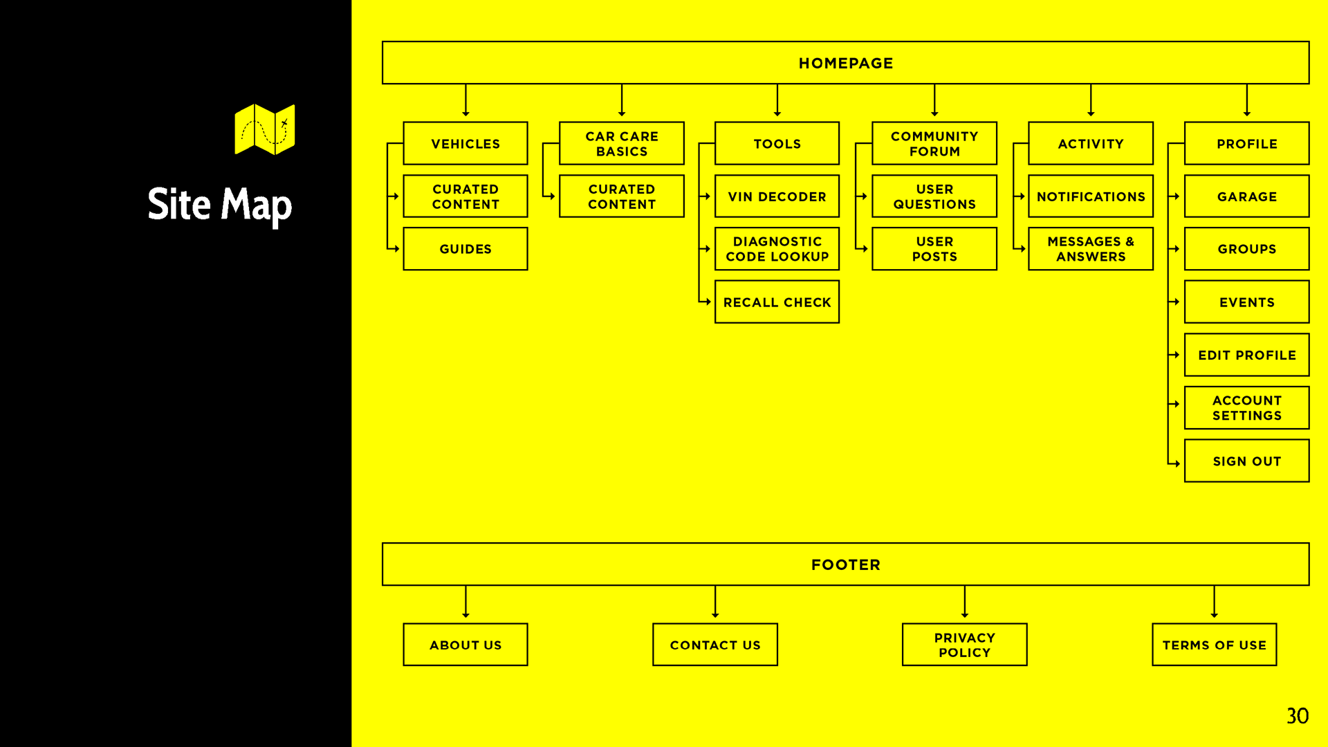
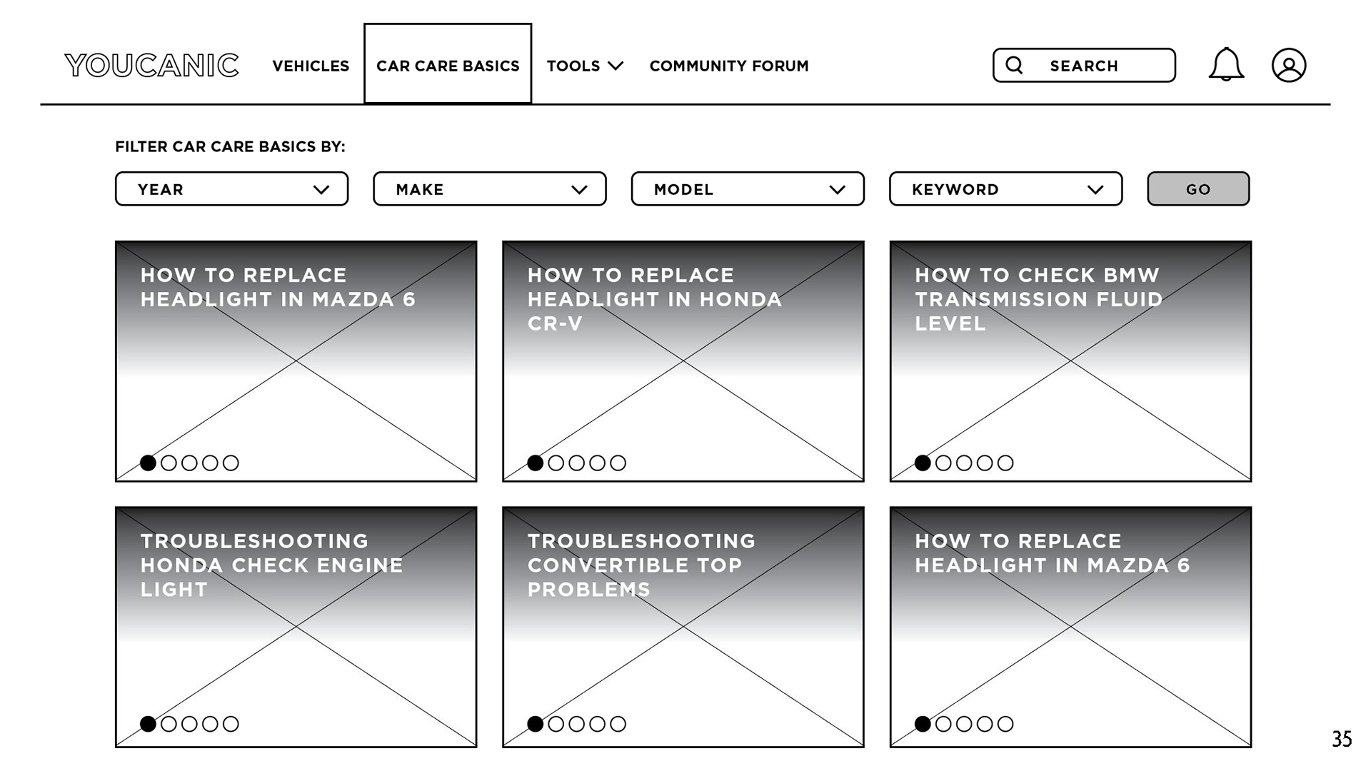
Proposed Site Map & Wireframes
Eventually, Matt made wireframes that seemed appropriate for the website, and we presented these ideas to the client.


User Journey Maps
We created user journey maps to help the client understand how our personas would navigate through the site and what they would gain the most from their experience.
Our Final Suggestions
In our final presentation to the client, we discussed some strategies that would help the website appear more appealing and trustworthy.
Some of our suggestions were:
•Changing the site structure immediately to make it more streamlined for members and first-time visitors to access and maneuver the site with ease.
•That in 6 months, have a vetting system in place to have mechanics join the site and give advice that would be beneficial to the site's members and visitors.
•Finally within a year, work on an affiliate program for members like mechanics and car enthusiasts to spread the word about Youcanic and in return give them an incentive on any recommended car products
Our suggestions were to be implemented within a year’s time to help new and current website users.